Responsive Layout
Layout arranges the components around your map. A container can hold a map, filters, a directory, or another supported component.
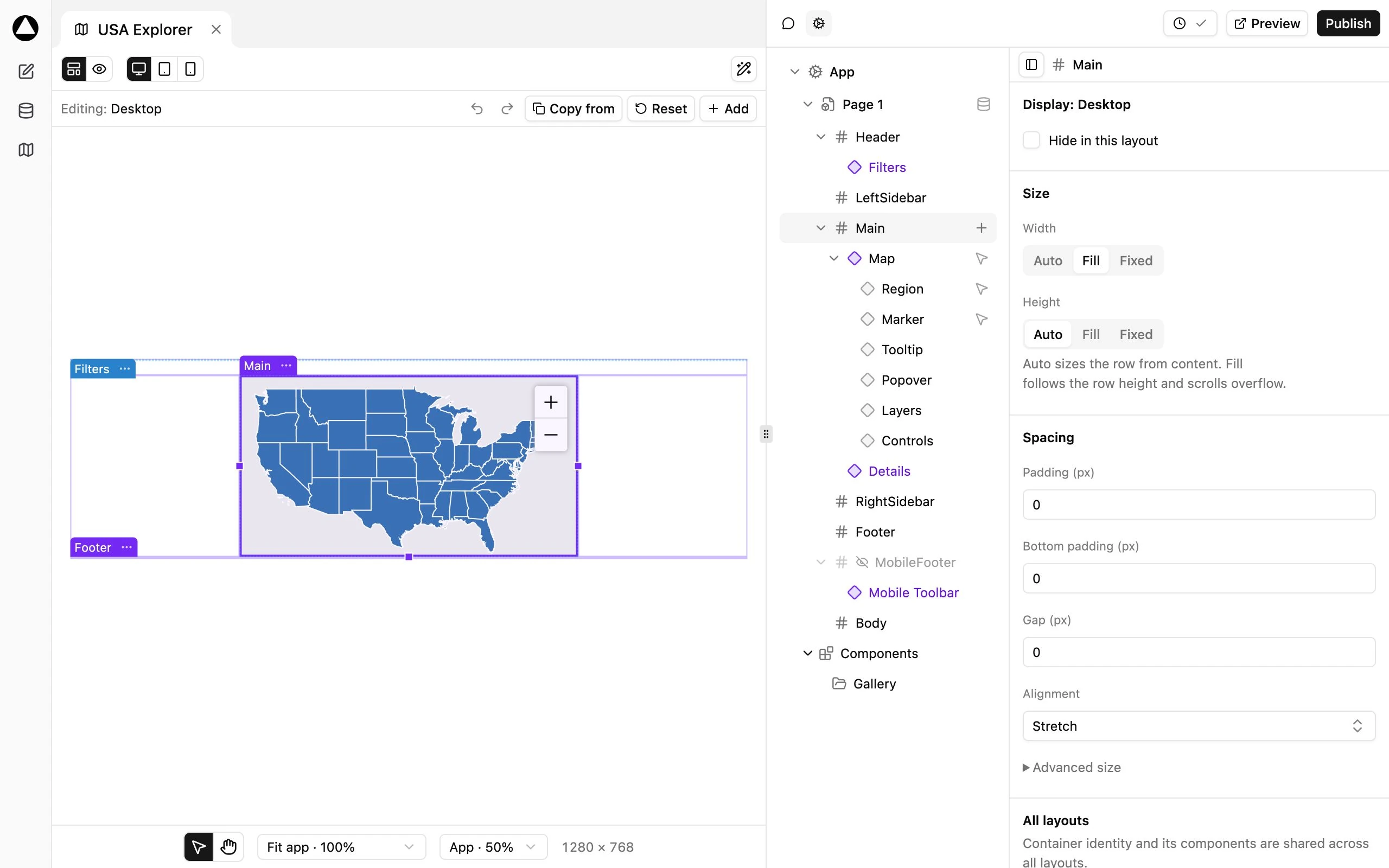
Select and arrange
Section titled “Select and arrange”- Open Layout above the preview.
- Choose the device and orientation you want to configure.
- Select a container on the canvas or in the App tree.
- Move components between supported containers using the tree or canvas drag controls.
- Inspect the selected container on the right.
The tree and canvas describe the same App. Selecting a container on the canvas selects its inspector. A component keeps its identity when moved, so its filters, templates, and other settings follow it.
Size and spacing
Section titled “Size and spacing”Use Auto, Fill, or Fixed where available. Auto follows content. Fill uses the available row space and can scroll overflowing content. Fixed gives the dimension an explicit size. Review Width, Height, Padding, Gap, and Alignment in the selected container’s settings.
Resize handles can prompt for a size-mode change when the gesture requires one. Complete the gesture and review its result. Undo/Redo applies to Layout authoring; do not assume it reverses changes made in Database.
Configure each layout
Section titled “Configure each layout”Container identity and its component membership are shared. Visibility, responsive dimensions, and spacing can differ by layout. Select the target device before hiding or resizing a container, and verify the toolbar’s active Layout label.
Hide in this layout preserves the component for other profiles. Delete removes the container from the shared structure and asks for confirmation; it is not a mobile-only hide operation.
New Apps include a MobileFooter for the Mobile Toolbar. Keep its mobile visibility unless your design provides another navigation path. On a small screen, verify that users can reach both Map and List when using a directory.
Check the result
Section titled “Check the result”Switch to Preview, select Arrow, and test Desktop and both orientations of Tablet and Mobile. Check scrolling, filter reachability, map height, and long directory content. Then publish the draft.