Filters and the form editor
Add Filters to your App so visitors can narrow down the results they see. For example, they can choose a category, search for an office by name, or find places near an address.
Connect Filters to one of the data sources available on the current Page. The filter form then searches that source, and components using the same source show the matching results. For an office locator, a category filter can update both the markers on the map and the offices listed in Directory.
Add Filters and choose a data source
Section titled “Add Filters and choose a data source”- Open the App panel and select Filters. If it is not in your page layout yet, place it in a container using Layout. See Responsive Layout.
- Open Settings and choose Page binding. This selects the data source the form will filter:
- Objects: records such as offices, stores, or other places.
- Regions: records attached to the map’s SVG regions, such as states or service areas.
- To filter a Directory list, select the same Page binding in Directory settings.
- Click Edit form to choose which filters visitors will use.
The available sources come from the current Page settings. If you want to filter records from a different Collection, first choose the corresponding Query for that Page’s Objects or Regions source. See Queries and Page bindings.
For example, if your offices are in the Objects source, choose Objects in both Filters and Directory. A visitor selecting “Regional office” will then see the matching offices in the list and their markers on the map.
Build the filter form
Section titled “Build the filter form”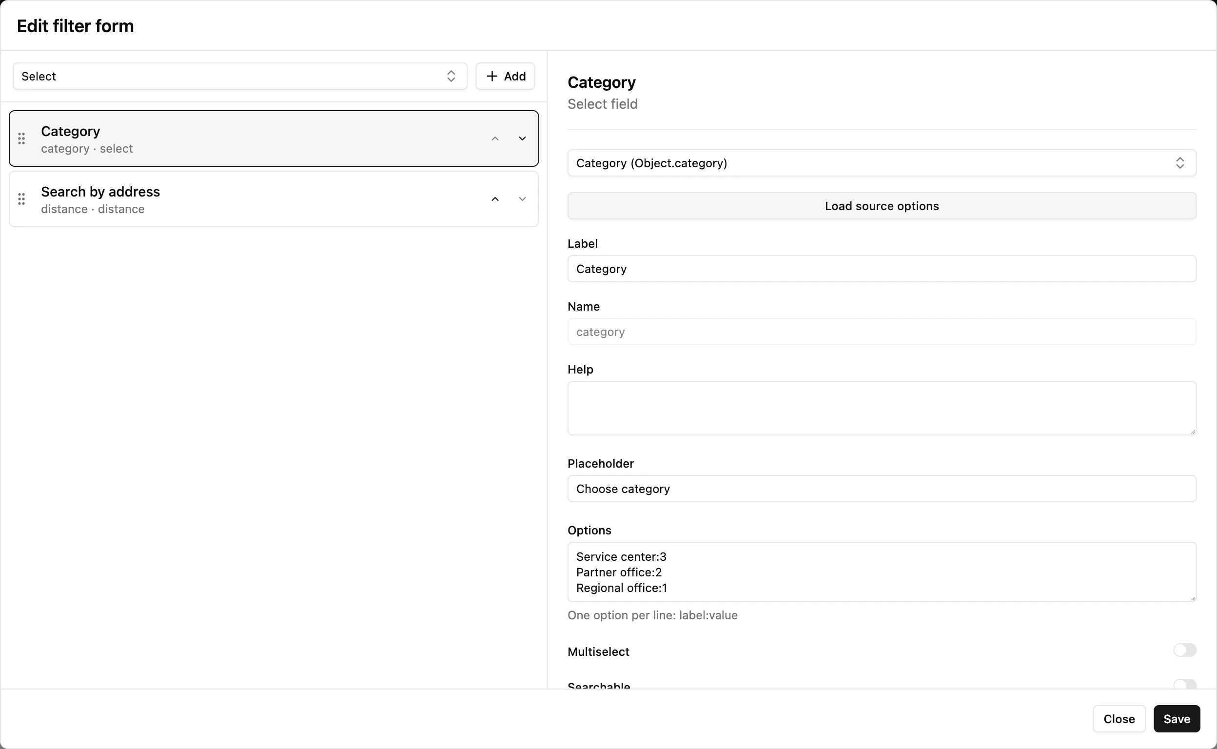
Use the form editor to add the inputs you need. Select an input to change its label, placeholder, linked data field, and other options. The field list and settings panel scroll independently.
Filter by category or another field
Section titled “Filter by category or another field”Add a select or radio control and connect it to a field in the selected source, such as category. Choose labels visitors will understand and keep the submitted values aligned with the field’s existing options.
For example, a choice labelled “Regional office” might submit the stored value regional. Visitors see the friendly label, while the filter uses the value to find matching records.
The field must be included in the source’s Query results. You can reuse an existing field for filtering; adding the filter input configures how visitors search that field.
Add text search
Section titled “Add text search”First, choose which fields text search should look through in the underlying Collection:
- Open Database → Collections and select the Collection used by your Filters data source.
- Open its Fields editor, select a field, and enable Searchable.
- Repeat for every field you want visitors to search, then save the field settings. For an office directory, you might make the office name and description searchable.
Then return to Filters → Settings → Edit form and add a text-search control. A placeholder such as “Search offices” helps visitors understand what to enter.
The text-search control searches the fields marked Searchable in that Collection. Configure those flags separately from the filter form. They belong to the shared Collection and apply wherever that Collection is used. See Collections and records for the Fields editor.
Search near an address
Section titled “Search near an address”Use the address/distance control when visitors need to find nearby places. Its source needs usable Location data, and the required address-search capability and Google services must be configured. Set the distance choices and units, such as kilometers or miles, in the control’s settings.
Save and try the filters
Section titled “Save and try the filters”Click Save in the form editor to apply the form to the current App draft. Save your form changes before closing the editor.
Switch to Preview and Arrow. Choose a category or enter a search with known matching records. Check the list and map, then clear the filter to show the available results again.
If a component does not respond, check that it uses the same data source as Filters. For example, a Directory connected to Objects follows the Objects filters; a separate Regions source has its own results.
Place and style the form
Section titled “Place and style the form”Use Layout to place Filters above, beside, or below the map or list. Check the arrangement on Desktop, Tablet, and Mobile so visitors can reach the form on each device.
Open Filters → Styles to adjust its appearance, including the supported background and padding controls. Layout can supply automatic spacing; check the result if you set custom padding or explicitly remove it.
The visibility and labels of the Clear and Search buttons are configured in Filters settings. When the form works as intended, Publish the App to make it available to visitors.