Tooltips and popovers
Tooltips and Popovers show information about a Region or Marker directly on the map. Use them to help visitors identify a place, read its details, or follow a link without first opening another page.
What is a tooltip?
Section titled “What is a tooltip?”A Tooltip is a small label that appears when a visitor moves the pointer over a Region or Marker. It is useful for a quick piece of information: a state name, an office name, a status, or a number. It disappears when the pointer leaves the item.
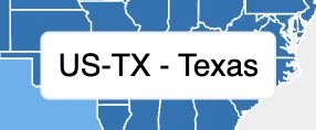
Keep tooltip content short so visitors can scan the map quickly. For example, hovering over Texas can show its name while the rest of the map remains visible.
What is a popover?
Section titled “What is a popover?”A Popover is a card that opens when a visitor clicks or taps a Region or Marker. Use it for information that needs more room: an address, a description, opening hours, photos, contact details, or a link.
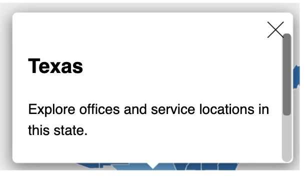
The card remains open while the visitor reads or interacts with it. They can close it, click away, or choose another item. You can configure its size and position, and use a fullscreen presentation on mobile devices when appropriate.
Which should I use?
Section titled “Which should I use?”- Use Tooltip for a quick label on hover.
- Use Popover for details on click or tap, especially when the content includes links or other interactive elements.
You can use both on the same map. An office marker might show its name on hover and open a card with its address and contact details on click. Popovers also give visitors on touchscreens a way to open information by tapping; hover tooltips are designed for a pointer.
Add a tooltip
Section titled “Add a tooltip”- Open the App panel and select Region or Marker, depending on which items should show tooltips.
- Open Interactions and enable Show tooltip for the mouseover action.
- Select Tooltip under Map. Use its Settings to choose the position relative to the pointer and Styles to adjust the supported width limits.
- With the Code editor available, open Tooltip → Code and choose the relevant Region or Object template to customize the content.
Start with a simple template, such as:
{{title}}You can include another available field, such as a status or number, as long as the tooltip stays easy to read.
Add a popover
Section titled “Add a popover”- Select Region or Marker → Interactions.
- Enable Show popover for the click action and choose the appropriate popover template. Configure a touch action too where offered and needed for your map.
- Select Popover to configure the card. Its Settings control positioning and centering; Styles control width, maximum size, and mobile fullscreen behavior.
- With the Code editor available, open Popover → Code and edit the selected Region or Object template.
For example, a record with a title and description can use:
<h3>{{title}}</h3><p>{{description}}</p>Add images, a Gallery, or links when they help visitors understand the place. Keep images responsive so the card fits on a small screen.
Where does the content come from?
Section titled “Where does the content come from?”The template receives data from the item the visitor points at or selects:
- For a Region, use its Region fields, such as its ID, title, and custom data. Related Objects can also be available in the Region’s template context.
- For a Marker, use the Object record that supplies the marker’s Location, such as an office’s title, description, and address.
For example, {{title}} in a Region template displays that Region’s title; in an Object template, it displays the Object’s title. The Page’s Query must return the fields you want to show. See Templates and record context for field types, related records, images, and formatting.
Try it on your map
Section titled “Try it on your map”Switch to Preview and Arrow. Hover over several Regions or Markers to check the tooltip, then click them to check the popover. Close and reopen the card, try a record with missing optional fields, and check Mobile for the tap experience.
If the content is empty, check that you selected the intended template and that its fields are available from the data source. Adjust size limits if a long description or image needs more room.
When the result is ready, Publish the App and check it on the actual WordPress page. These examples use Popover for detail cards; the current Details View limitation concerns the separate Show details view action.